Analytics reporting continues to make major strides in both efficiency and depth, thanks to game-changing programs like Power BI and an automated database. But generating comprehensive data is only half the battle. Unless this information is presented in an intuitive, digestible way, the true power of these measurement tools stay locked away. We’re communications experts, after all, which is why we put just as much thought into the visual design of our analytics products, as we do the underlying data itself.
Through a collaboration between our analytics, media, and creative teams, we workshopped our dashboards from all angles, ensuring the data was as precise, user-friendly (internally and externally), and customizable as possible. “We want to emphasize that this is about teamwork,” explains Analytics Director, Cathleen Wells. “It takes partnership to build a tool that is truly collaborative. As we’re always stronger together.”
Below is a sample guide for dashboard data, visuals, and KPIs.

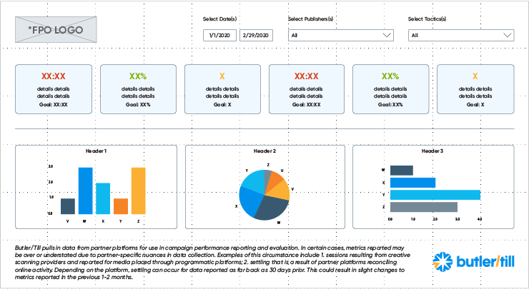
Below is a sample wireframe for a branded dashboard.

And these dashboards didn’t just have to feel right, they had to feel like Butler/Till. Every solution we offer is the product of input from many facets of our agency, so our output must reflect that united brand consistency. This means font and color considerations, of course, but also how we visualize data and even how we tell our analytics stories. All of these elements had to fit together seamlessly.


