What does analytics and color theory have in common? Both are used to influence decisions, capture attention, organize thoughts, build structure, and provoke conversation.
Use of color in data visualization is an effective way to communicate information, thoughts, and messages to our clients in an organized and digestible manner. Color not only carries our brand throughout a dashboard, but it functions as one of the key visual design elements that helps us remain cohesive and recognizable to our peers, our partners, and our clients. At Butler/Till, we have a distinct set of primary brand colors as well as additional reporting colors used by our Analysts.
Below is our primary brand color palette.

Below is our secondary reporting color palette.

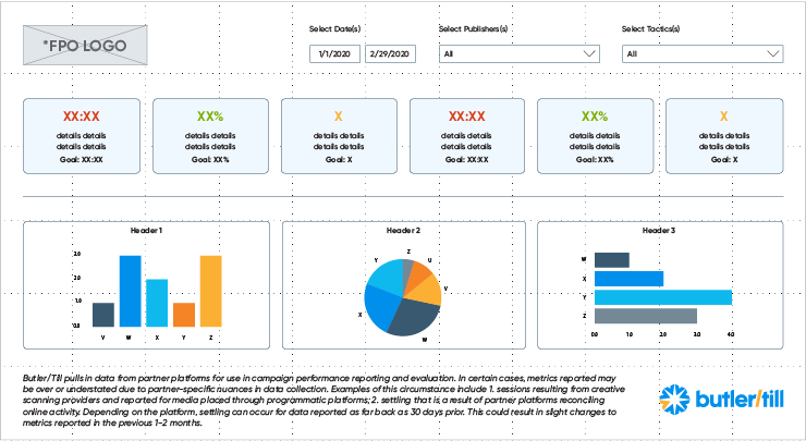
In our measurement frameworks, our bright blues act as primary colors, our yellow and orange are used to highlight key information, and our muted blues are used as supporting elements. Blue and orange are complimentary colors, meaning they oppose each other on the color wheel. This creates visual contrast and stability, ultimately leading to a visually well-balanced dashboard with maximum legibility.
Below is a sample wireframe for a branded dashboard utilizing our color palettes.

Our goal when practicing color theory in data visualization is not to utilize every color we have in our dashboards to “make it pretty,” but rather to use color strategically and deliberately to tell a story with supporting visual elements to paint a more insightful picture for our partners and clients.


